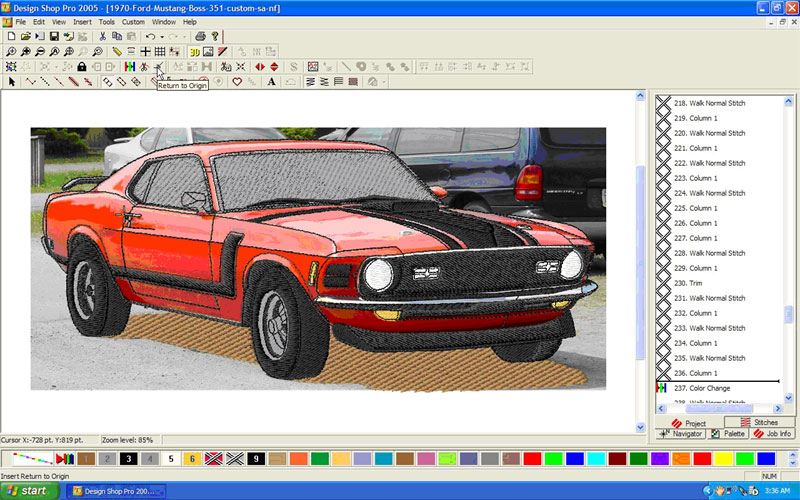
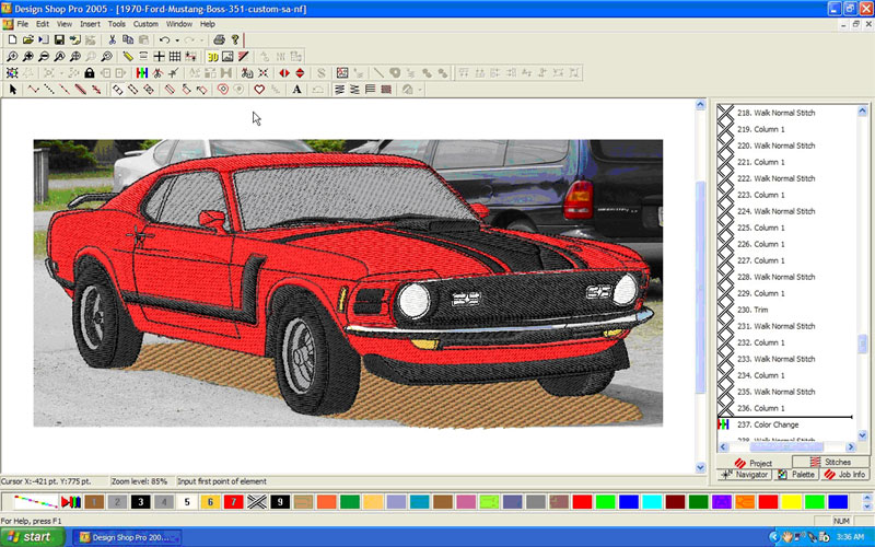
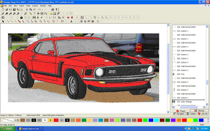
Most digitizers do not like to work from photos of any kind. The reason? Concrete lines are harder to find than on most logo artwork. Also, with photos there are many shadows that either can be hard to create in a realistic fashion or can be left out altogether.
Some digitizers prefer to turn their artwork into vector files before they begin the process of digitizing. On a photograph, that can be a long and arduous project.
| 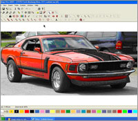 |
| Screen Capture 1.1 |
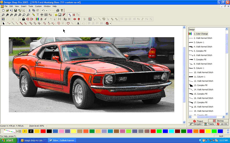
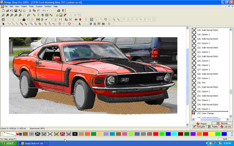
My solution to this problem is to create the outline first. I chose a photograph of a car as my example. I digitize many cars, and they all come to me as photos, often taken at car shows. Sometimes, without a concrete outline, it is difficult to see where one car ends and the other car begins, especially if the cars next to each other are the same color. This particular photograph doesn’t have that problem, however.
When looking at the screen capture 1.1, you will see that the design, which so far is only one color, starts with a color change. By putting the color change first, I can insert other colors ahead of the outline that I created and won’t be working with the same color. However, if I didn’t have that color change there, I would be working with the same color, making it difficult to see where I’m going with my stitches. This example has the completed outline, shown in 3D to see the stitches.
Because working in 3D takes more power from the computer than the flat version of the stitches, I don’t work in 3D as I am digitizing. The black against the black of the picture would be very difficult to see, so I usually choose a bright color, red or yellow or bright blue, while I am working. I only change the color once the area that I am working on is finished.
|  |
| Screen Capture 1.2 |
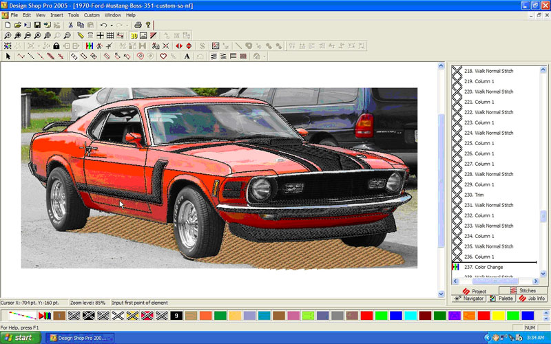
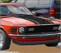
Once the outline has been completed, it’s time to start at the beginning. You will notice that on the right side of the screen capture 1.2, there is a black line between numbers 236 and 237. That is the insert line, showing me where I am placing each command. By this time, I had completed the design. However, I have turned off the colors so that you can see the order in which the car was digitized. Hence, the Xes on the color chart at the bottom of the screen.
On most photos, there is a shadow below a car, caused by the sun shining on the car. I like to use that shadow in the design, for the simple reason that there is so much black on the bottom of any vehicle. If this design were to be stitched on a black garment, much of the detail in the design gets lost. Placing a shadow of another color under the vehicle makes it stand out from the garment and adds a realistic touch to the design. I usually use a light fill for two reasons. One, it doesn’t add so many stitches to what would already be a quite intensive design. Two, a light fill provides just enough color to contrast with any garment. Here I chose a tan, like gravel, but gray for concrete, or charcoal for pavement would also work.
|  |
| Screen Capture 1.3 |
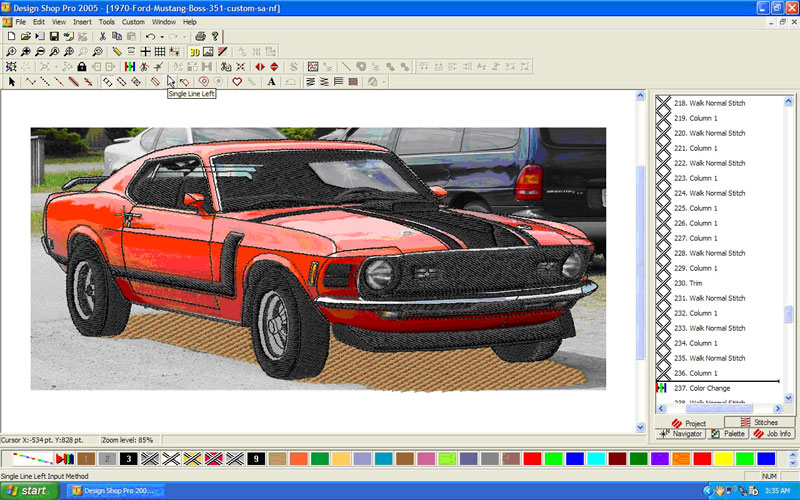
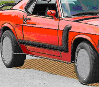
I have digitized so many cars, that I have found a system that works pretty well for me, and consequently, I almost always go in the same order. The next color in the design is the silver wheels.
I should back up a second and mention that I didn’t do all of the black outline at the end. I could have chosen to make the tires part of the last outline, but I did not. While I am a firm believer in changing thread colors as few times as possible, there are times when layering the design is also important, and may cause the use of a color more than one time. This is one of those times.
The tires are underneath the car, and so, I also like the black thread that makes up the tires to be beneath the thread that stitches the body of the car. This technique adds dimension to the design.
The same theory applies to the silver in the wheels and rims. This silver needs to be beneath the black, but the silver that trims the body of the car needs to be on top of the main body color.
Also notice the running stitches (Screen Capture 1.3) from one silver section to the next. Though this adds stitches to the design, running stitches take less time than either machine trimming or hand trimming (for those who don’t have machine trimmers), and should be used to move from one color section to another whenever possible.
|  |
| Screen Capture 1.4 |
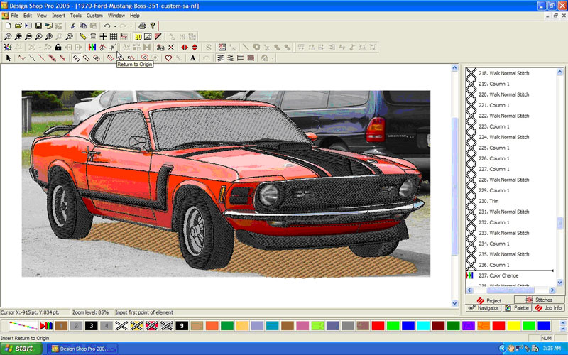
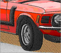
The next color in the series is the black of the tires.
Notice that the black detail on the silver hubcaps is stitched in the same sequence as the tires (Screen Capture 1.4), as is the black underbelly of the car. The order is determined by what appears closer in the view with the underlying things stitched first and the wheels last in this color on the bottom. Since the interior of the car is also black, I chose this time digitize that portion as well, using running stitches to get from one section to the next all the way through.
|  |
| Screen Capture 1.5 |
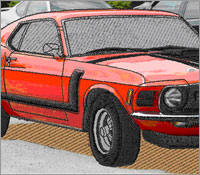
Now it’s time to start working on the body of the car.
Though it’s a little difficult to see in a screen capture (1.5), I always do the windows, especially in a large car design where I have also digitized the interior, as a light fill. That way, you will be able to see the interior of the car through the stitches of the window, making the design look very realistic.
Charcoal or gray are good colors for windows, but another great choice would be a white or clear lamé thread. Lamé thread is shiny, as are windows.
|  |
| Screen Capture 1.6 |
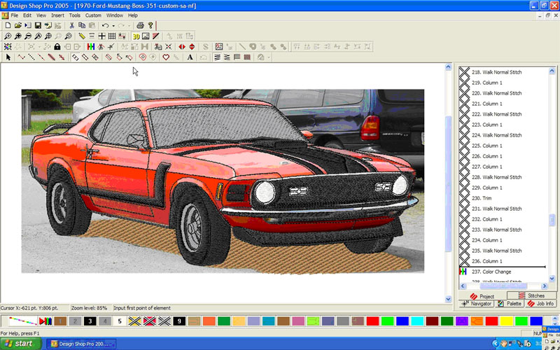
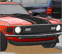
The next color is white, as you can tell from the color chart at the bottom of the screen (Screen Capture 1.6). The white is for the headlights, which in the dimensional scheme, are under the silver trim. A running stitch between the lights is possible since both the black that is already digitized, (but we are inserting the colors ahead of) and the silver will cover those stitches.
I could have chosen to stitch the car body next. It really wouldn’t matter. Most of the time there are reasons for the choices. In this case, however, the white and the red of the car body do not intersect, so either choice would have been OK. Mine was the lights.
|  |
| Screen Capture 1.7 |
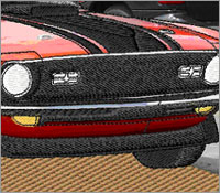
I also chose to add the small light on the side of the car and the fog lights on the front, which I made deep yellow, or amber (Screen Capture 1.7). Stitching these before the body allows running stitches between the fill patterns again.
Even though it appears that most of the car is left to do, the hardest work is now done! The body of the car is usually a series of fill patterns, and the outline that was digitized way back at the beginning serves as a guide for where to place the fills.
|  |
| Screen Capture 1.8 |
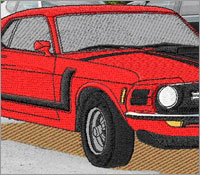
One thing that I really like to do is to break the body of the car (and other large areas, as well,) into small sections, and choose different fill directions for each of them (Screen Capture 1.8). That process really brings out the shape of the car, and adds highlights because of the way that the light hits the threads.
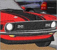
The final color, which is still inserted before that first black outline, is silver, which makes up all the trim on the car (Screen Capture 1.9).
As stated back in the first paragraph, the secret to working with a photograph is to define the lines before you get started.
|  |
| Screen Capture 1.9 |
Before on-screen digitizing was invented, it was a time-consuming process to draw the outlines on an enlarged version of a photograph. Another option was to completely re-draw the image, usually with the help of an overhead projector.
It’s still time-consuming to draw the outline with a mouse. One of the advantages of doing it in this manner is that one color of the design is already done when the outline is complete. The second is that the placement of all the other fill patterns is clearly defined and good registration is a snap.
Try it. It’s not as hard as you think!