


























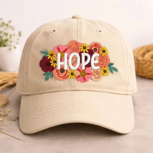




Elegant Letter Heads Embroidery Project
Lettering on caps is not as difficult as it might seem, if you understand a few basic rules.
Materials
Project Preview Video

Cut Away Stabilizer - 2.5 Oz wt.

Cut Away Stabilizer - 2 oz wt.
Lettering on caps is not as difficult as it might seem, if you understand a few basic rules.
Traditionally, cap embroidery has been considered the scourge of the industry, something to be avoided whenever possible due to the high-probability of low quality results. And if the design is straight lettering, the odds against perfection climb even higher. But it needn’t be that way. Lettering on caps is not as difficult as it might seem, if you understand a few basic rules. In fact, successful cap lettering depends more upon your knowledge of the product being sewn than your proficiency with the software. See if this sounds like your shop:
If this describes your situation, then sadly I must inform you that you are doing it all wrong. Success with cap embroidery starts with understanding the physical limitations of the process. Thus, we must go back to my two rules for cap embroidery. Rule #1 - The Design Must Fit The Cap The single leading cause of cap problems is trying to sew a design that is too large for the given cap. Design height is restricted by crown height and shape, which restrict the available sewing area. As the machine sews higher on the crown, the cap driver moves in closer to the machine, which forces the machine arm deeper inside the cap. Once it makes contact with the cap fabric, it will push on it and distort the embroidery. The result can be outlines that don’t line up, distorted lettering and even circles sewing as ovals. Short crowns, or ones that slope back dramatically, allow this unwanted contact between the sewing arm and fabric to occur sooner, thus limiting the space available for the design. Even if the sewing arm does not make contact, the larger the design, the more it tries to flatten out the curvature(s) of the cap. This can lead to straight lines not being straight, uneven text, and puckering of the cap material. Caps are not created equally, and some can handle larger designs better than others. In general, limit your design size to 2.0” H X 4.5” W. This way you should be able to sew on just about any style of cap. In actuality, you can go larger for some caps (especially five-panel), but if you make it a standard practice to work with tighter parameters, you will be better off in the long run. Also, having the customer focus on the smaller size helps get an order started on the right foot. It’s much easier to increase the size for a larger cap than to decrease it for a smaller cap. TIP – Use a standard business card as a reference for maximum (cap) logo dimensions. The toughest aspect of adhering to this rule is having to tell the customer that something won’t work. There is always the underlying fear of losing the customer, so most embroiderers plunge full speed ahead with the ordering process, by saying YES to everything the customer wants. (The details can always wait until later.) Since the primary goal of the sales process is to close the deal, this is a natural - but dangerous - tendency. Unfortunately, when it comes time to sew, you will likely struggle through the job with many quality issues and hundreds of thread breaks. So don’t let the customer dictate what will be sewn on the cap. This is a team effort. You must balance their desires with what is physically possible. Rule #2 - The Cap Must Fit The Frame The second most common mistake made in sewing caps is trying to use a cap that doesn’t match up to your machine’s cap frame. Each frame has a built-in curvature that needs to mate with the horizontal curve of the cap to be sewn. If these two surfaces don’t match up, then you will have to force the cap to fit the frame, which will lead to distortion in the front panel. And of course, this will lead to sewing problems.
|

There is another solution for dealing with different cap styles and shapes. Rather than limit what you offer, why not expand your capabilities? Because there are so many different caps on the market, each with different size and shape characteristics, it is not possible for one style of cap frame to work with every cap. Most embroiderers only have a single type of frame, which came with their machine. However, there are other styles available. Initially, this may appear to be an expensive option, as the typical cap frame costs around $250.00 and you need two of each style per head. But, if you do a lot of cap embroidery, the investment is worth it as you will be able to accommodate a wider array of cap styles. I can’t emphasize enough the importance of following these two rules, as they will solve about 90% of your cap problems. If the design doesn’t fit the cap and/or the cap doesn’t fit the frame properly, it is nearly impossible to achieve consistent, high-quality sewing, no matter how proficient you are with your software. Further Guidelines Okay, once you have a clear understanding of these two basic rules and are willing to apply them consistently, the rest of the process becomes much easier. With cap embroidery, there are four traditional recommendations (not to be confused with rules) for creating designs as follows:
These are really just guidelines (not rules), because it turns out that they don’t apply in every case. When it comes to lettering, the concept of center-out usually works against you. In most cases, you are better off sticking with sewing left to right, or vice-versa. Lettering height should be larger than 3/8” and thick columns are better than thin ones. A combination of perpendicular and zig-zag underlay is desired and works well underneath wider columns. The perpendicular stitches will help anchor the fabric prior to the zig-zag stitches, minimizing the opportunity for the underlay to stick out from under the final top-stitching. However, if the column is narrow, then you will only be able to use a perpendicular underlay. Keep in mind that most software programs allow you to adjust the width of the zig-zag underlay, so use it. Ideally, the underlay will only be a half to three-fourths as wide as the actual column above it. This will give you a slight margin of error, to compensate for any unwanted shifting of the top stitches. If you have two or more parallel lines of stitching, they should both sew the same direction, either right to left or vice versa. |
If you are doing two-color lettering, then you need to sew each letter completely, before going on to the next one. Do not try to sew all of color one, then go back and do color two, because it won’t work! On this design (see right), if you were sewing a black fill with a red border for each letter, the sequence would be fill, then satin; fill, then satin, etc. If this design is for a five panel cap, you can just sew from left to right while making sure each letter is sewn completely as described above. However, if it’s a six panel cap, the intensity of the sewing is such that each letter becomes a design of its own. A lot of pressure is applied to the sewing surface, which can lead to fabric distortion. This becomes a good case for the center-out concept. Consider sewing the G first, then U, then O, then C, then A, then R, then S. Follow this up with Varsity Softball straight across. (The vertical green line simply represents the center seam on a six panel cap. Font Selection Another area to consider is font selection. Just because you have 100 standard fonts to choose from doesn’t mean you should offer all of them to your customers. Much like limiting your headwear selections to cap styles that work well with your cap frames, only offer fonts that you know for a fact will sew well on headwear. Through experimentation, you will find that some fonts work better than others on caps. Identify them and stick with them! To sum it all up, successful cap embroidery is more dependent on the physical factors of the framing and sewing process than anything else. Go beyond the acceptable parameters, and you will encounter problems. The trick is to understand, accept and apply the limitations that exist on every order that you take. This will ensure high quality production and low levels of stress, the perfect combination for attaining embroidery bliss! |

