Watch an embroiderer rummage through a bin of thread. She will hold a spool up to the light, tilt it this way or that, admire the sheen, the intensity, the hue, the richness of the tint. She might engage in a conversation about thread storage or a confession about how much thread she owns. Find a crowd of machine embroiderers and you've found a crowd of color addicts. Each and every one of us revels in our extensive thread collections. Not one of us can pass a thread sale without buying. Obviously, embroiderers appreciate color. We appreciate color, yet we seldom exploit colors' possibilites. I speak for myself. I will pull out the correct three shades of green to paint the leaves of an oak. I will stitch a rose in four shades of pink to delineate every shadow. Yet, I haven't been using these colors beyond painting realistic thread pictures. I haven't used the beauty of my threads as thier own statement. Until recently I used color only to paint pictures or to stitch tone-on-tone designs. I was at a quilt show when I first realized I wasn't using colors well. Going from quilt to quilt I was awed with the breathtaking mastery of color. The flying geese blended from dark to light. The log cabins had the perfect balance of bright and subtle. The pinwheels moved around the course of the color wheel. The beauty of the colors was engaging. I wanted to immerse myself in colors, inhale them, surround myself with color riches. Luckily, I had the tools to do this. I own an array of colors equal to the fabric stash of any quilter -my thread collection. We all could benefit from my lessons from the quilters. They USE colors. They don't just paint a picture with the right shades of green. They tantalize our senses with the play of color against color. Thus began my experimentation with colors and a new direction for my work. I started with a simple black top using Sewing Workshop's Riviera Top. I chose the colors one of the quilters had chosen; bright fuchsia, hot pinks and electric blues. From right to left, I moved the colors around the color wheel. From top to bottom, the colors ranged from bright to pale. I placed them in an even pattern and loved the results. |
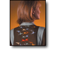
For my next foray into the world of color I chose colors I found in a piece of chenille fabric; a lovely muted tobacco brown, flecks of gray, camel, a greyed green and some rusts. Using a simple set of embroidery designs placed in an irregular pattern I stitched the front and back panels of the Kowloon Coat by Purrfections. Another winner, and so different from most of my work. I've just begun the journey into understanding color. It's an exciting trip. If you're interested in pursuing color in this way, read the following suggestions. |
Choose Your Colors The world is filled with wonderful color combinations. It's easy to find collections of colors. The first step on your color exploration journey is to choose one. Inspirations For Color My first suggestion is to use the first resource I used; quilts. Quilters manipulate color every day. Examine a multitude of quilts; so many colors, vibrant, gorgeous combinations of colors. If you're lucky enough to have a quilt show available, attend it. If the timing is wrong and no quilt shows are available, check out the quilting sections of the local library.
Choose a quilt and examine the colors. Look at the following:
What colors are used?
What is the background?
Are all the colors in the same value (light to dark)?
Are the colors bright and clear, or subtle or greyed? There's a big difference between rose and hot pink, yet both are pink.
How do the colors move from one color to another? Is there a clear trip around the color wheel? Does the artist use colors on opposite sides of the color wheel?
Do the colors use different intensities of the same color? Peach and bright orange are samples of the same colors in different intensities.
Do you see any one place that catches your attention? Often quilters will have one brightly contrasting area. I utilized this technique in the brown coat with a single bright orange set of cranes.
Books on Color I collect books on color and color theory. I've been doing this for years, long before my trip to the quilt show epiphany. I bought them to titillate my senses. Now I find them an excellent resource for my color exploration. Most of these books show a variety of color combinations -whether in artwork or just swatches. What a wonderful place to find a color combination you love. Nature On your next walk just look around. Compare how the color of the sky contrasts with the trees, the grass. Have you looked at all of the colors in a sunset? Hot pinks, bright oranges, golds, all set against blues. Artwork No question, artists are artists. Look carefully at the colors that are put together in a painting you like. Ask those same color questions from above. |
Fabric
It's always easy to find pleasing color combinations in fabrics. I have a surprising piece of yardage of yellows, blues, and reds. How would these colors look in embroidery?
|
Your Thread Stash
Even before this new interest I have loved my thread rack. I tend to buy Robison-Anton threads. In addition to rich and varied colors Robison-Anton labels their threads with alluring names. I've always enjoyed seeing how 'Daiquari Ice' looks next to 'Liatris Lavender'. What an aural and visual treat!
Play with your threads. Pull the spools off the rack, spread them out and see how they relate to each other. This can inspire a color masterpiece. |
The Next Step - Designs Choose a design or designs. Solid color designs work best, allowing the color to be the focus. Consider the size of the design. Remember that you will sew this design multiple times to showcase multiple colors. I found that designs in the 1 1/2" to 2" size worked well. I didn't want large designs which could overwhelm the wearer. Because you're using multiple colors, you can use a single design repeated a number of times on the project. Or you can use a set of designs like the cranes on the brown wool. These designs are similar to each other, with minor variations. Because I had trouble finding designs that met these specifications, I designed a few sets of my own. You can view them at www.bullarddesigns.com. |
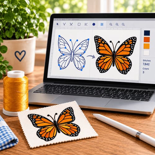
Design Placement Designs can be placed in even rows and columns or scattered irregularly across the fabric. Designs in rows and columns have a military look and add rhythm to your piece. Designs less precisely placed give a more casual feel. Examine the two garments I've included. Look at the difference between the arrangements. Play with your placement. Rearrange the designs on screen in your embroidery machine's software. Or, trace your design on paper. Stack several sheets of paper and cut out your design. Use these cutouts to play with design placement. Another item to check when looking at designs is the negative space, the space between the designs. Does the negative space overwhelm the overall effect or enhance it? |
Raise Your Colors Color work offers many options. It also includes a large number of variables; the background color, the design, the placement of the design and the colors. Don't let this overwhelm you. Follow the steps outlined above and you too can successfully play with color. So the next time you look at your thread collection don't just stand there, do something. Create a color masterpiece! |
|