

























Creating High Quality Embroidery IV Embroidery Project
Make sure your design is readable
Materials
Project Preview Video

Cut Away Stabilizer - 2.5 Oz wt.

Cut Away Stabilizer - 2 oz wt.
Make sure your design is readable
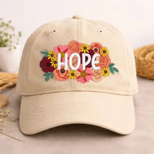
The whole purpose of embroidery is to create a visual eye-catching presentation. Whether it’s corporate identity products, or monogrammed towels, the intent is the same. When setting up a particular job, be sure that it is readable. Print out the design, tape it on the wall, then back up about four feet. Can you clearly see the details of the design? Back up another 2 feet and look again. This is how other people will typically view the design. From a distance, not close up. We spend too much time with our face only a foot from the computer monitor, and don’t always get the proper perspective. With this concept in mind, avoid tiny, skinny letters that are too close together. Within reason, thicker letters are better. Also, less is better when dealing with smaller designs for left chest and hats. Work with the customer to define how much space is available, then limit what goes into that area. If Bubba, of Bubba’s Towing Service, wants to have the name of his business, a picture of a tow truck, all three of his phone numbers, his business address, the website URL, and his slogan “You bust em, We drag em” incorporated into his design, then you better steer him towards a jacketback placement. It will never fit properly on the left chest or front of a cap and be readable. If he still insists on one of those placements, then get creative. Stick with the business name, tow truck picture, and city info for one location, such as the front of a cap. Place the website URL on one side of the cap and the slogan on the back. Forget about the phone numbers. No one remembers them anyway. Now you have three separate designs, each being sufficiently large enough to be easily read. In addition, you just earned yourself some more money on the job while making the customer happy. Another concept of readability is to ensure that the stitches aren’t lost in or distorted by the fabric. Embroidery depends on a smooth, tight surface to support the stitches properly. Textured fabrics such as corduroy, pique mesh, terrycloth and sculpted knits cause the stitches to shift and distort. To prevent this always use a topping when dealing with textured fabrics, which creates a smooth surface on top of the textured one. The same thing goes for thick fabrics such as fleece or sweaters, which allow the stitches to sink into the fabric. Use of a topping prevents this. The ultimate goal is to have a design with crisp, clean details. |
