

































Three Common Digitizing Mistakes and How to Avoid Them Embroidery Project
Geer shares secrets for overcoming the most common goofs, from as simple as a lack of planning!
Materials
Project Preview Video

Cut Away Stabilizer - 2.5 Oz wt.

Cut Away Stabilizer - 2 oz wt.
Geer shares secrets for overcoming the most common goofs, from as simple as a lack of planning!
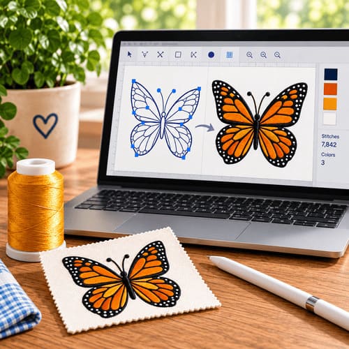
Good digitizing skills come from practice and experience. Each time you digitize for a new type of fabric, you learn something. Most digitizers have learned by good old trial and error, which consists of digitizing the design, sewing it out, and evaluating the results. To see poor digitizing all you have to do is take a good look around you. A trip to a local discount store should do the trick. On the other hand, there are equally as many great designs. When you receive your trade magazines each month, you are treated to the best of the best. Some of the world’s best digitizers are featured on a regular basis and observing their work is a great way to learn what to do and what not to do. There are some common goofs that most beginners make that can be avoided with a little information. Here I’m going to talk about three of them and some solutions. As you also will find out as you learn to digitize, there is often more than one solution for a problem. So here are some goofs I see and hear about a lot. 1. Lack of Planning Before any good digitizer begins, he spends time planning and pathing his design. A good design works from the back, or objects farthest from the eye, to the front. You also should take into consideration the number of color changes: the fewer, the better. Pathing is a technique that has you digitize so that all thread of the same color sews at the same time. It should start with a color that’s in the background. Another goal of pathing is to move from one section of color to another of the same color without picking up the needle. That is not always possible, and sometimes thread colors have to be repeated in order to retain dimension but this should be the exception not the rule. You also want to minimize the number of trims. When you need to move from one area to another, walking stitches are more efficient than thread trims. Any time the embroidery machine doesn’t have to stop saves time and increases productivity. With all the scanning software available, I find that many designs are poorly planned, if at all. Many customers have come to me with designs that they had “digitized” and ask why they don’t work. To me, digitizing is more than mere scanning. Certainly a design can be scanned and converted to stitches, but after that process, a digitizer needs to edit that design and make sure it is clean and efficient.
3. Little or No Underlay Underlay serves several purposes. First, it is used to secure stabilizer to the garment. Secondly, it eliminates stitching problems on difficult fabrics. Third, it makes the design stand up on the garment. Fourth, it can be used to add dimension. By following a few rules for underlay, you can solve most of your stitching problems. First, sew a line of stitching completely around the circumference of the design to tack the backing to the substrate. This also creates a nice solid workspace on which the embroidery is placed. When placing underlay beneath a fill pattern, stitches that run the opposite direction of the fill will keep the fill from sinking into the weave of the garment. A light fill can even be used as underlay and works especially well on hard-to-sew garments like piqué and polyester fleece. It holds down the fibers and allows the fill pattern to totally cover the area. Finally, underlay on columns serves the same purpose. A walking stitch in the center will make the column puff, adding dimension. Edge walk stitches are great when a column borders a fill, keeping the column from sinking into the fill. A light density narrow column works well on terry, making those hard-to-stitch towels a work of art! |


